Graphics & Imagery
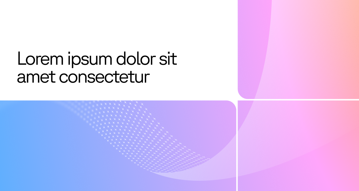
Wave
The wave graphics introduce a sense of flow and motion across the brand. Used primarily as background elements, they bring subtle depth and texture, with a range of variations to suit different compositions while staying visually consistent.


Frame
The frame is a modular graphic device used to structure layouts and highlight content.

Wave + Frame
The frame can be overlaid on top of the wave graphic to create depth and visual consistency. A white content box may also be used within the frame to contain text and improve readability.
Photography Style
Photography should feel natural, warm, and authentic. Capture people in real moments rather than staged scenarios, with candid expressions and relaxed body language. Lighting should be soft and natural where possible, avoiding harsh shadows or overly dramatic effects. Environments should feel lived-in and relevant, helping to ground the subject in a real context.

Iconography
Icons are simple and easy to understand, using clean shapes, consistent line weights, and rounded forms to feel approachable. Colour is used to differentiate and add emphasis. In use, icons can sit alongside text within containers to highlight key points.
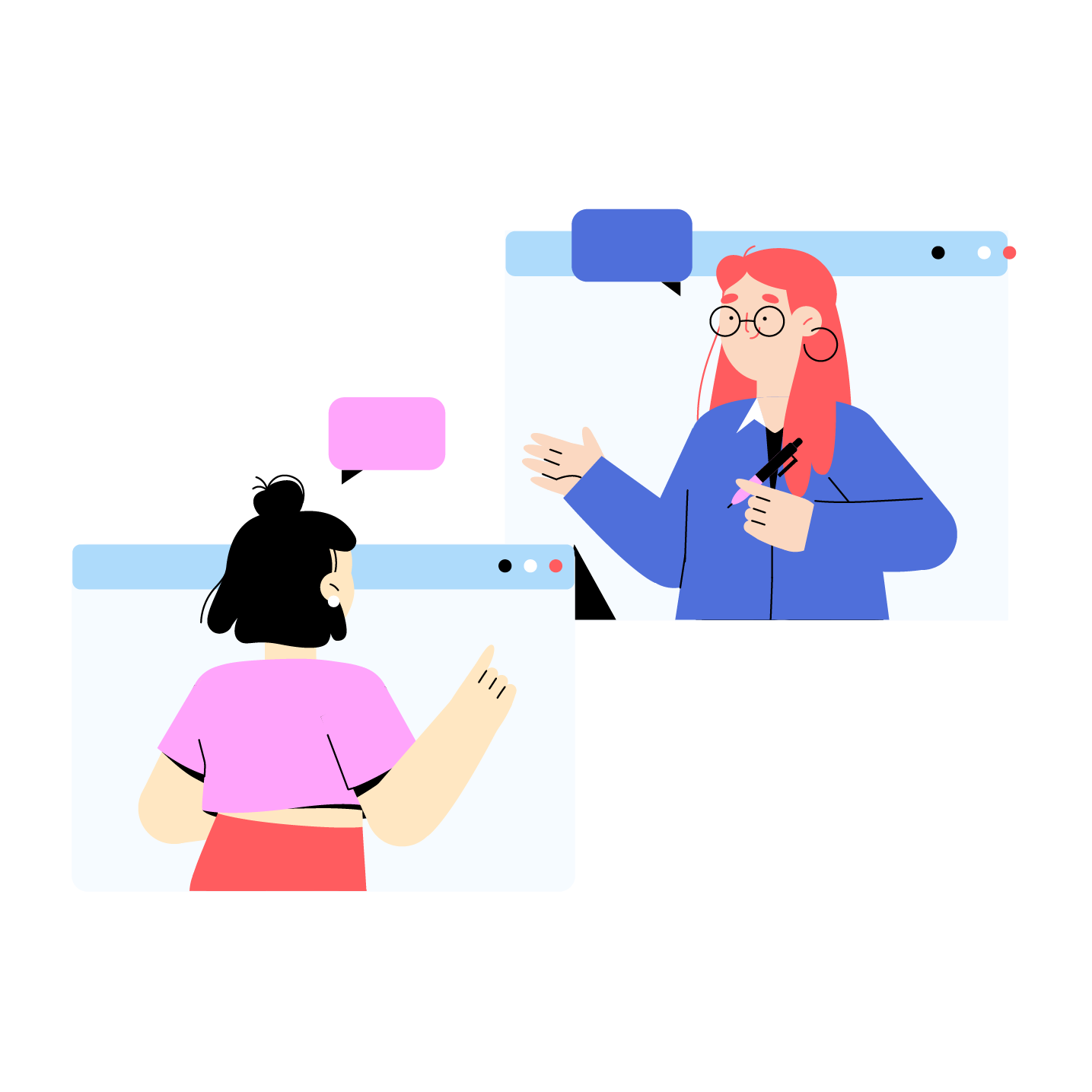
Characters
Character helps us show, not just tell. It brings clarity, emotion and a human touch to our brand, making complex ideas easier to understand and connect with.