
TYPOGRAPHY
FONT
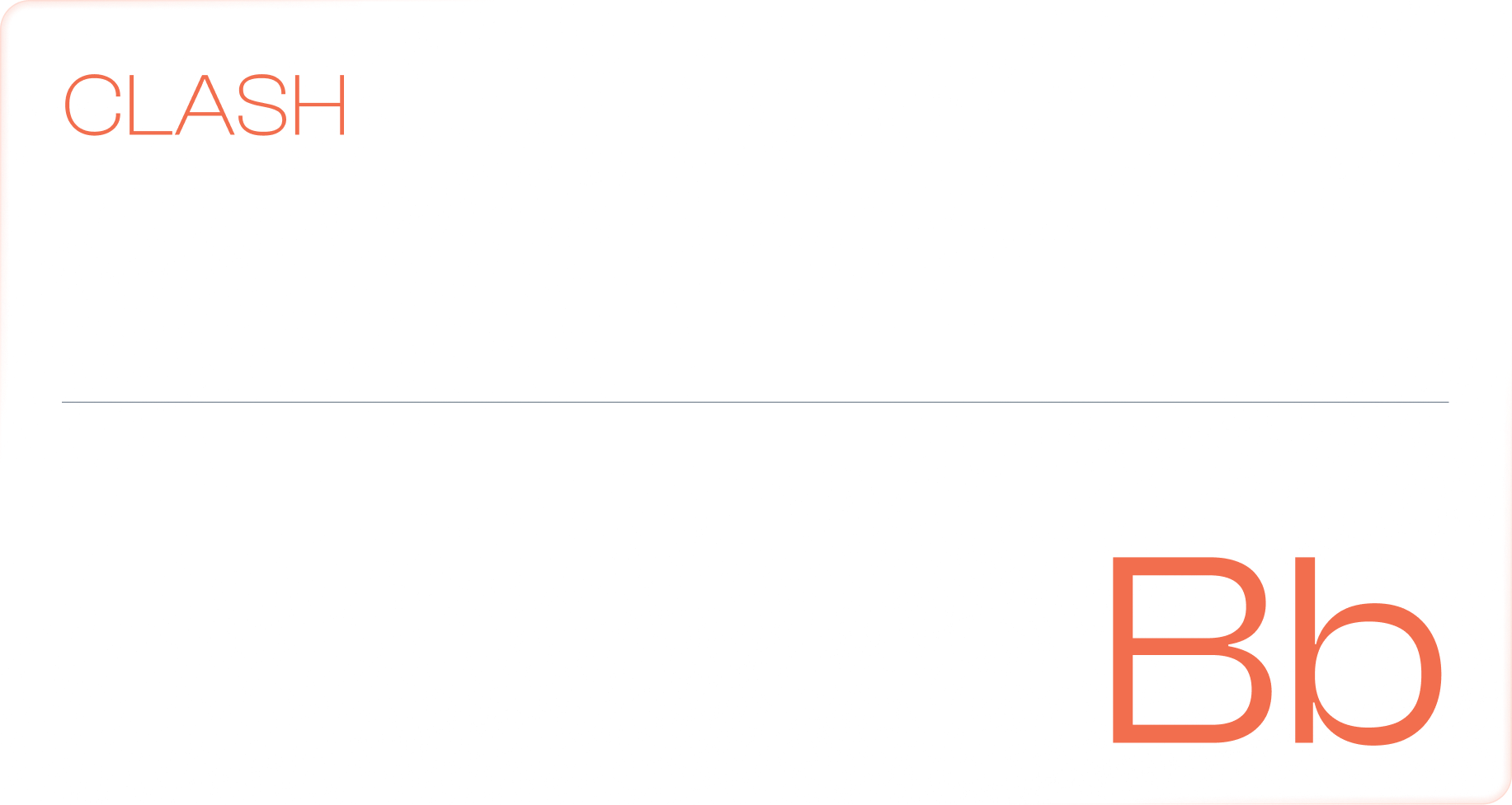
Clash Display is our primary display typeface for headers, chosen for its strong, confident character and all-uppercase design that creates a bold, commanding presence. It establishes clear hierarchy and ensures immediate visual impact across key messaging.
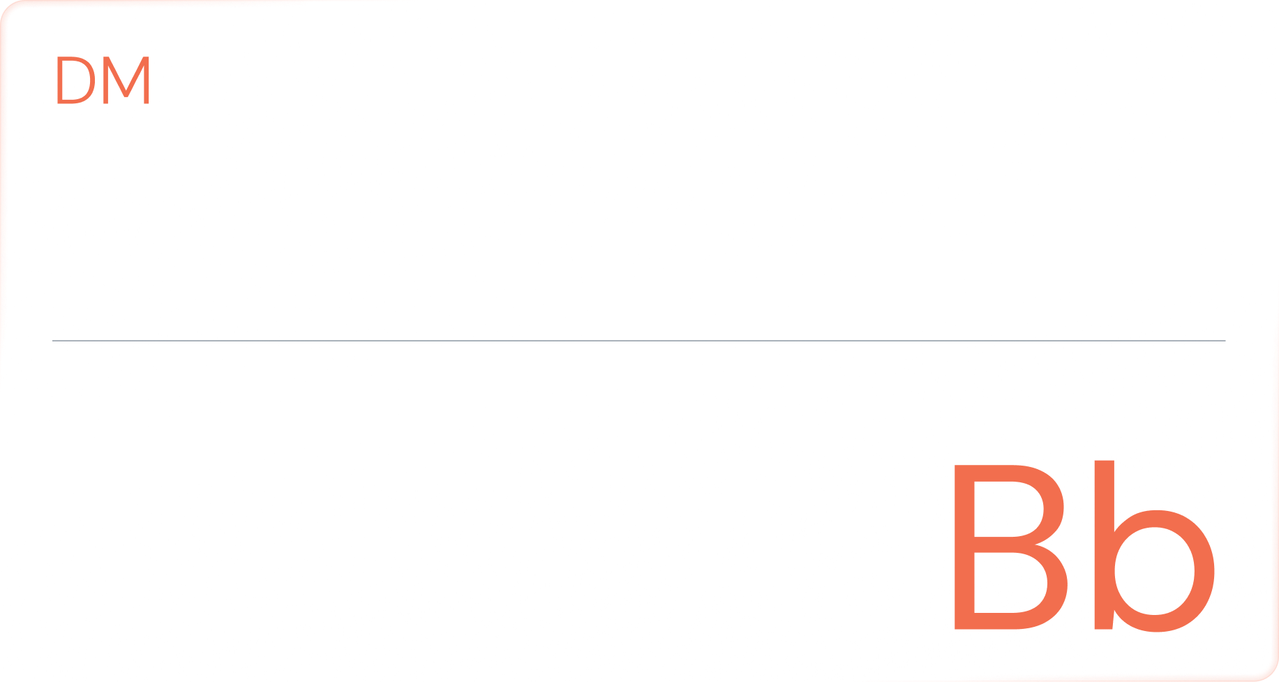
DM Sans serves as our core body text font, providing excellent readability, a clean modern tone, and balanced spacing that supports longer-form content across digital and print applications.
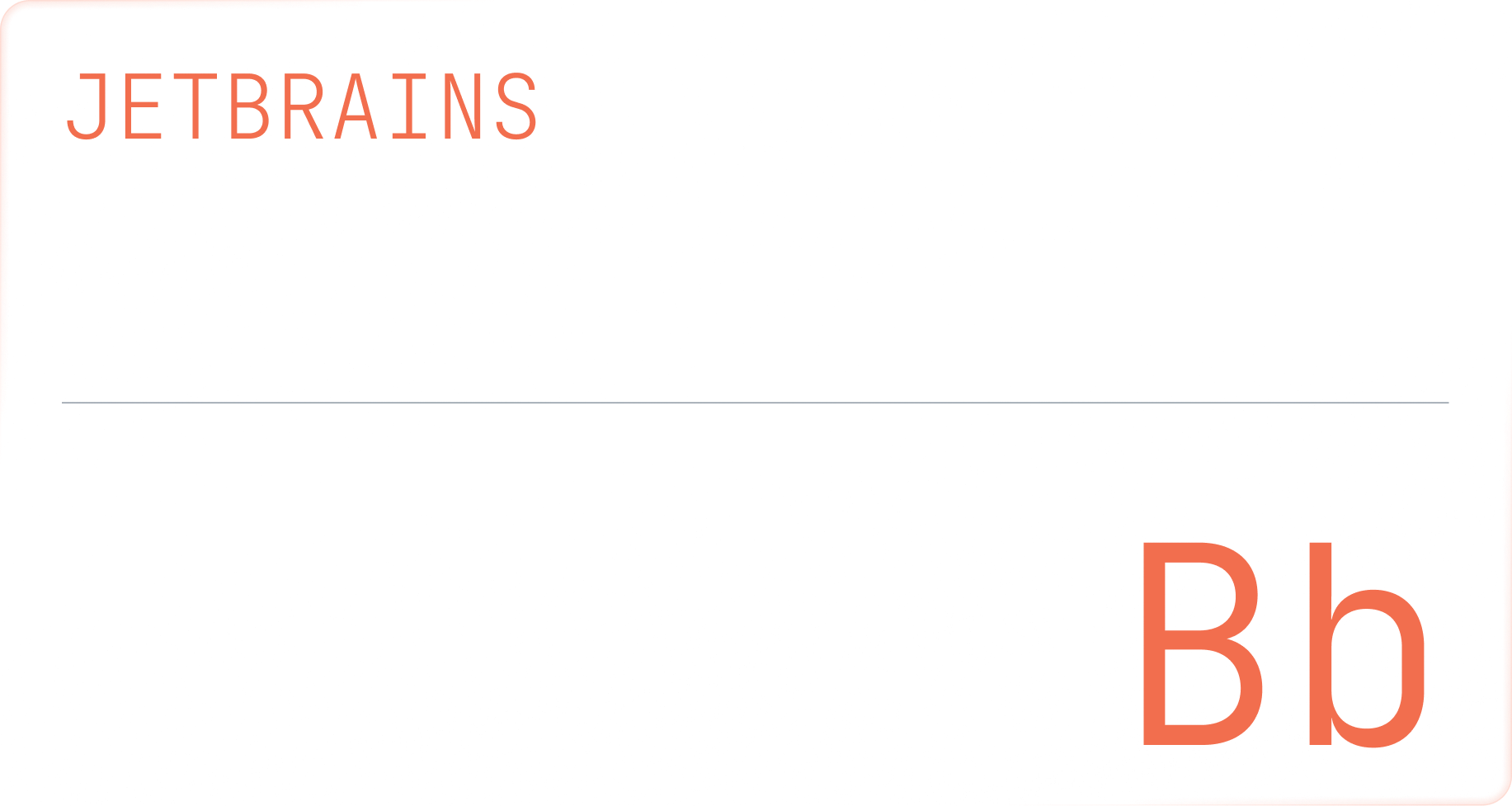
For accents—such as tags, labels, and UI micro-elements—we use JetBrains Mono. Its technical, structured feel adds precision and contrast, helping highlight details without competing with primary content.
FONT USAGE
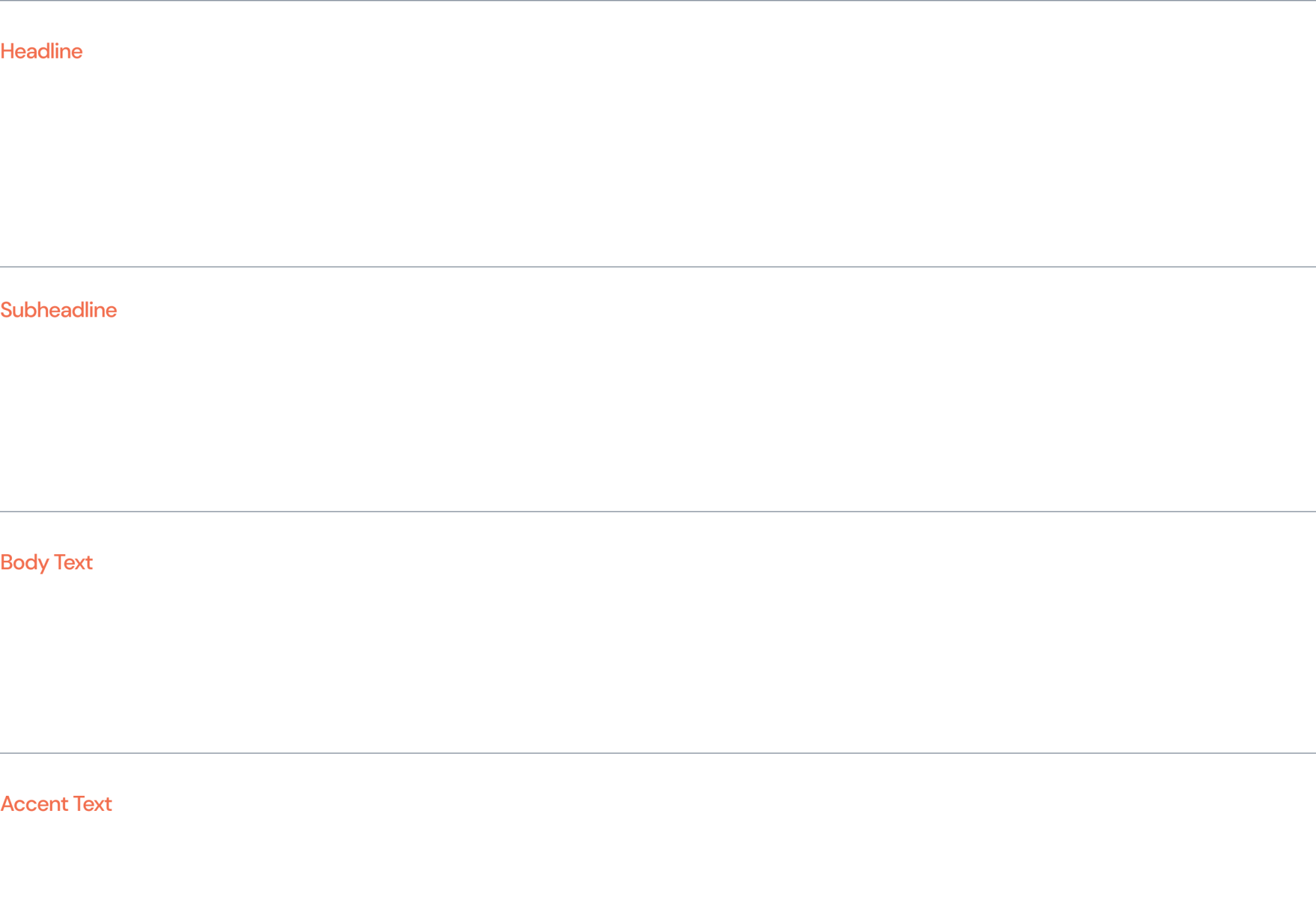
The following visual demonstrates the recommended typographic hierarchy. It includes guidance on font sizing, weight, line height, and letter spacing for headlines, subheadlines, and body text.