Layout
Shapes & Shadows
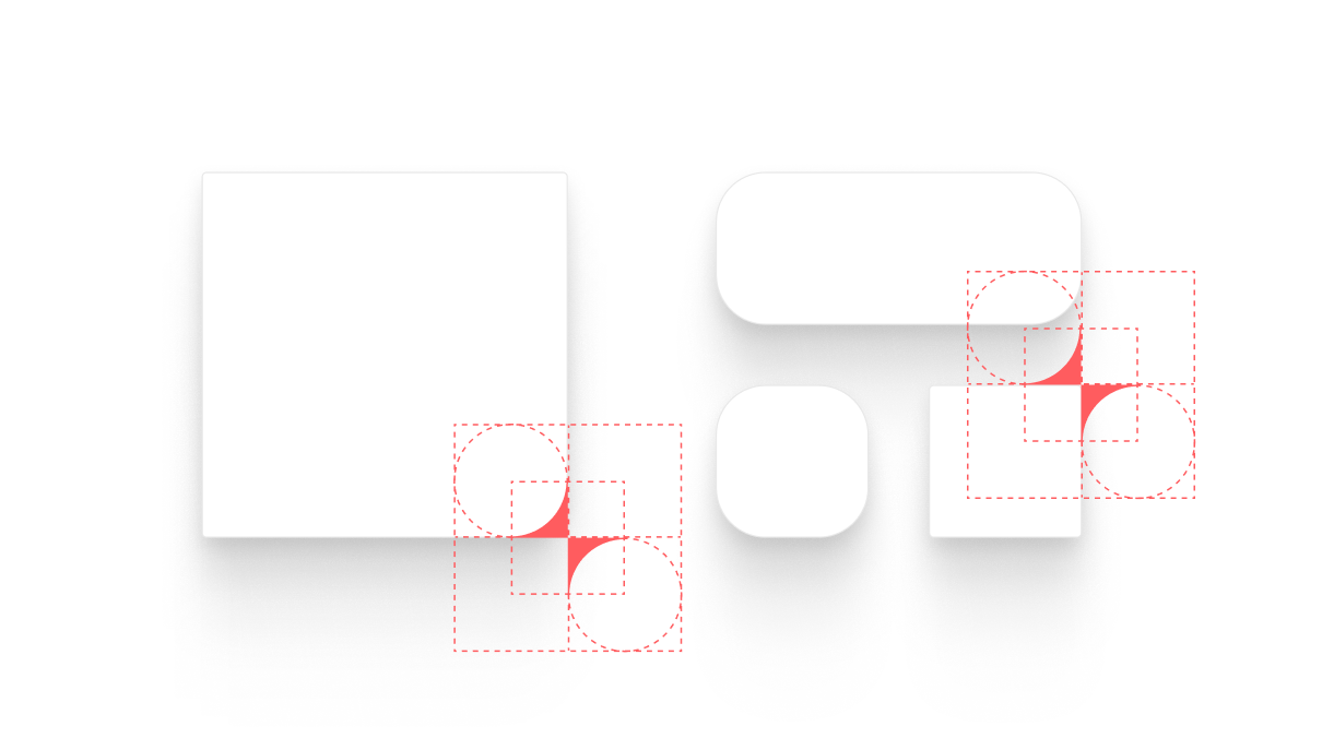
Shapes are built using the geometry of the logo icon, which defines the rounded corners and overall form. This allows for a mix of corner radius—typically one more pronounced rounded corner paired with smaller, subtler ones—to create a distinctive and flexible visual language. Shadows are soft and diffused, adding depth while keeping the overall look light and minimal.
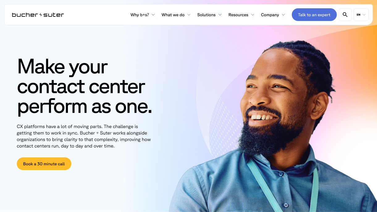
Website Hero Treatment
Each hero uses a gradient wave graphic positioned to the right, creating a consistent visual language across pages. The gradient transitions into a softer light blue on the left, ensuring strong contrast for readability and clear legibility of the headline, supporting copy, and CTA.
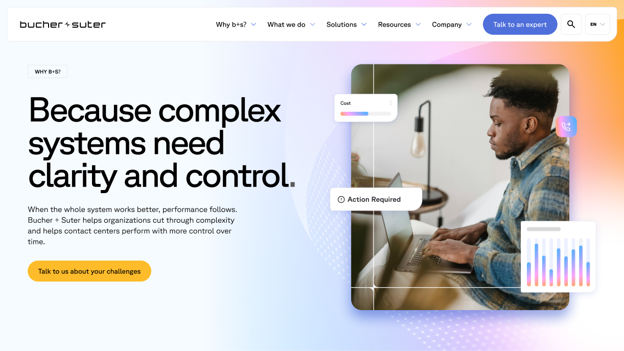
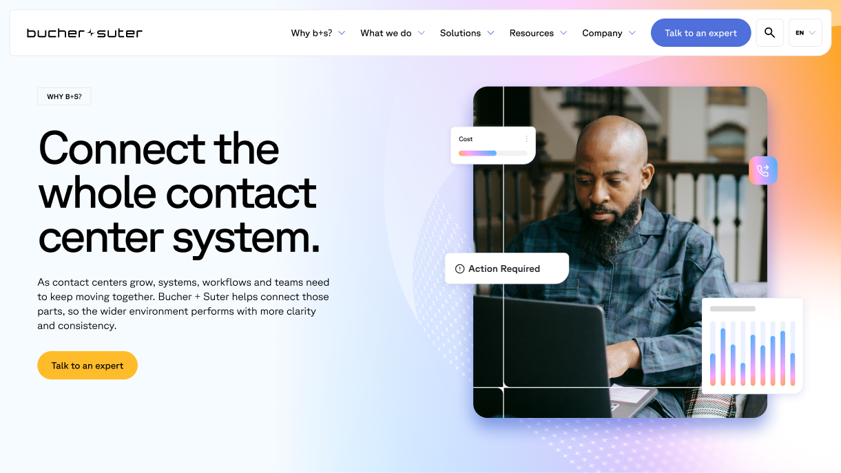
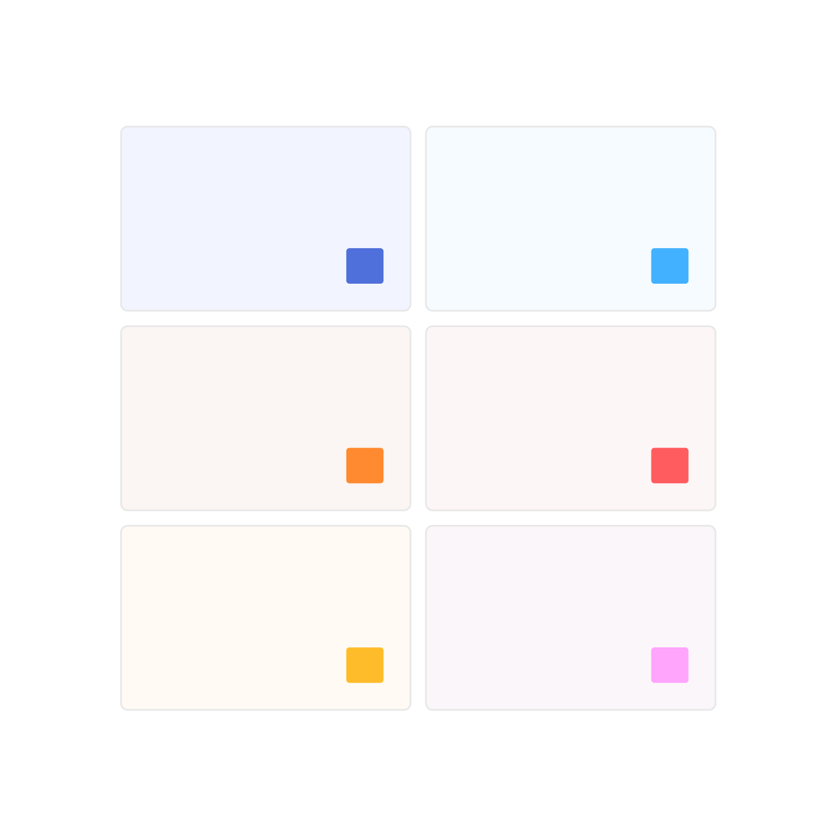
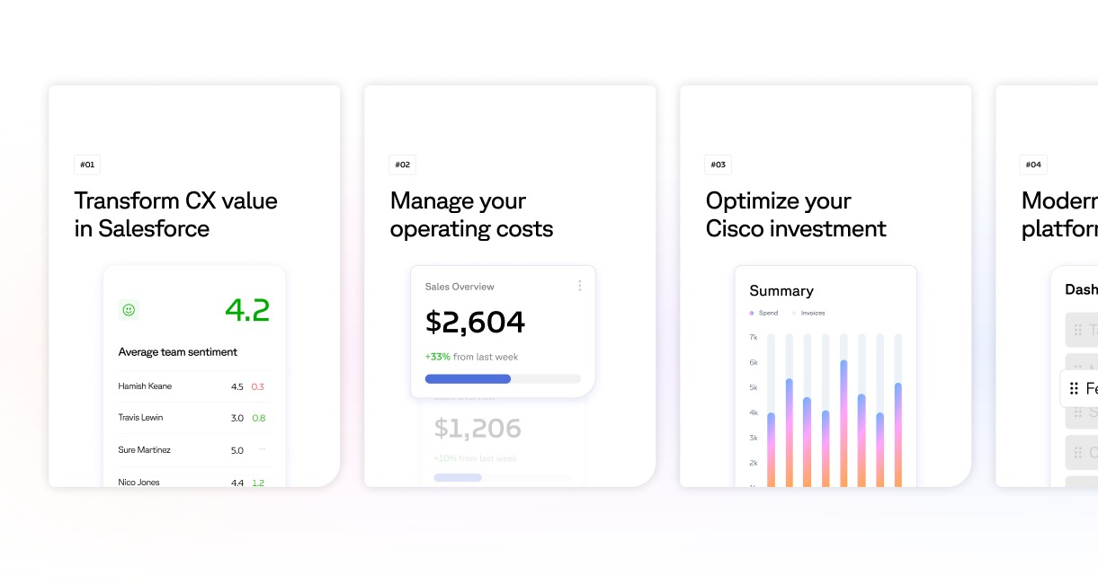
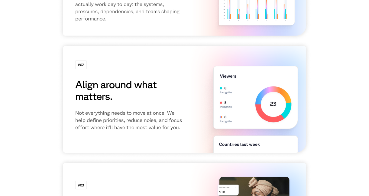
Cards & Gradients
Soft gradients are applied within and behind cards to create depth and separation. This adds a subtle sense of layering, helping key content stand out while maintaining a clean and cohesive interface.
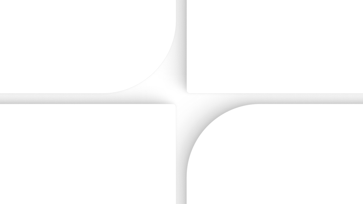
Page Frame
A graphic frame element used to structure layouts. It can be applied as a border to contain and define page content, adding clarity and consistency across layouts.
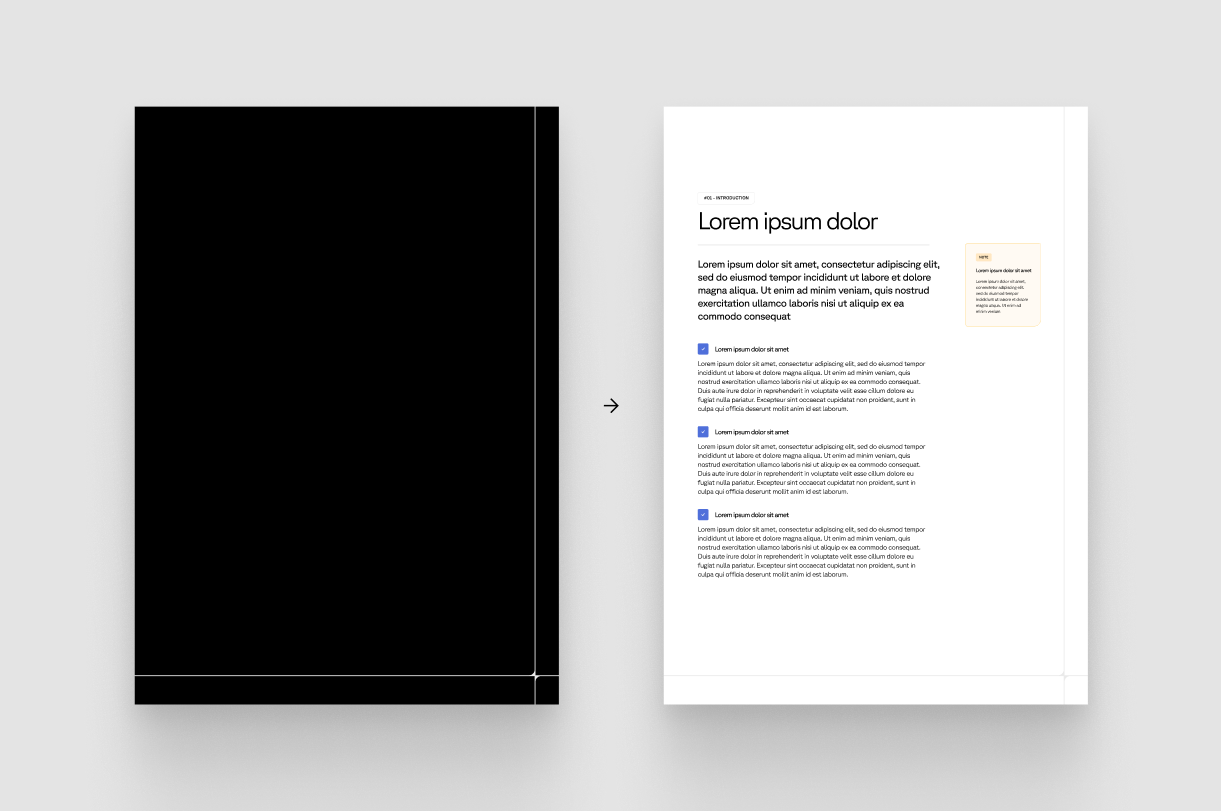
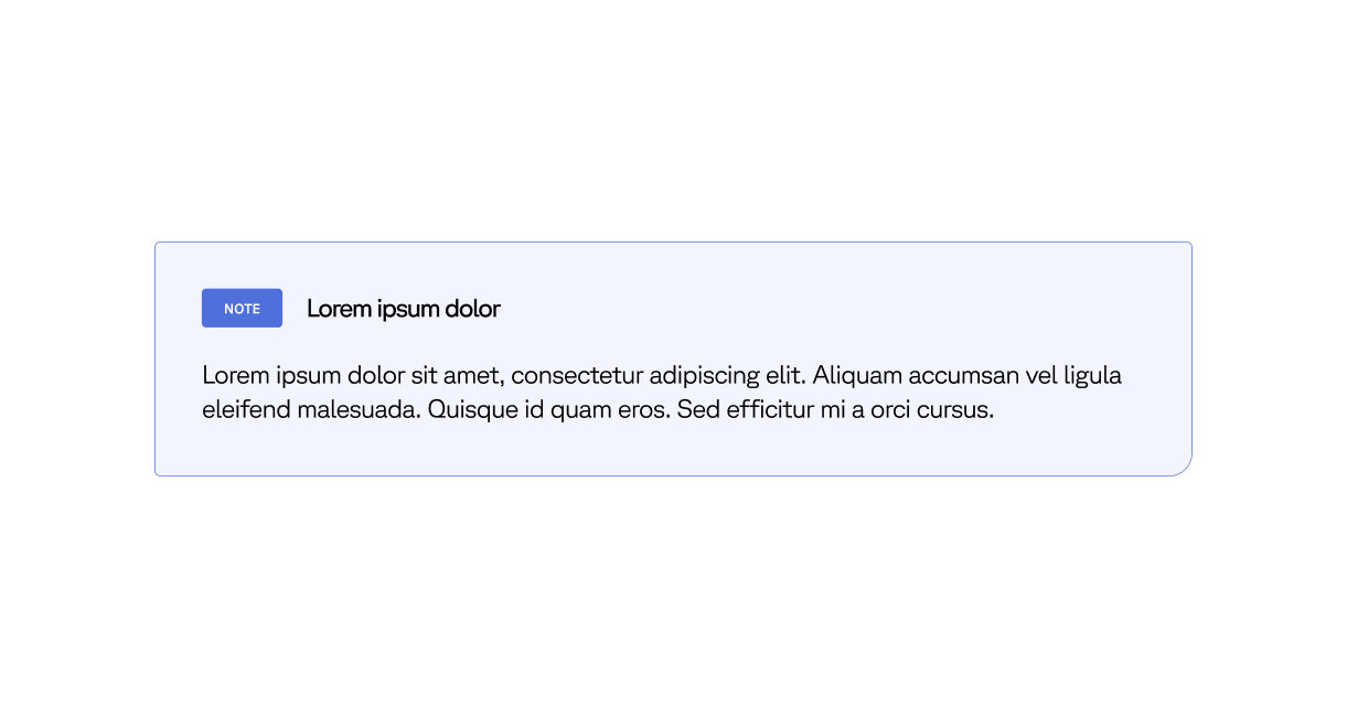
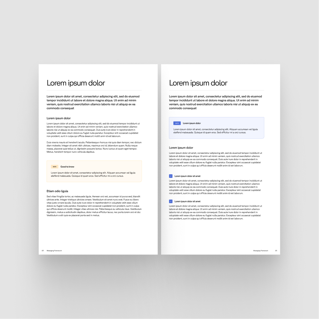
Highlight Notes
Soft colour notes drawn from the palette to call out key information. Used across websites and publications to highlight important content without disrupting the overall layout.